Modernising the look and voice, to stand out from the crowd.
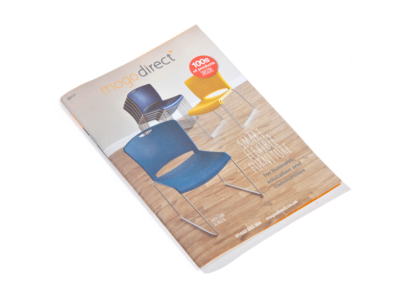
Mogo was established in 2003 selling a small range of own brand Mogo folding chairs and tables to schools, churches, community centres, leisure centres and other multi-functional spaces. Mogo has grown over the years by continually broadening its product range to include stacking chairs, staging, conference seating and classroom furniture to these same market sectors, while focusing on great value and the best levels of customer service.
The main objective was to make a move from producing two catalogues to just one that would cover all sectors (previously, two catalogues have been produced: one targeting the education sector, and one targeting community and leisure venues).
Mogo wanted to present a greater range of products, reflecting the broader range already advertised on their website, as well as communicating their product quality and customer service. They also wanted a move to a layout that allowed this broader range of products to be advertised and helped customers to understand the use of each product more easily. Finally, they wanted customers to be able to compare product options effortlessly, and give bundle deals a greater emphasis.
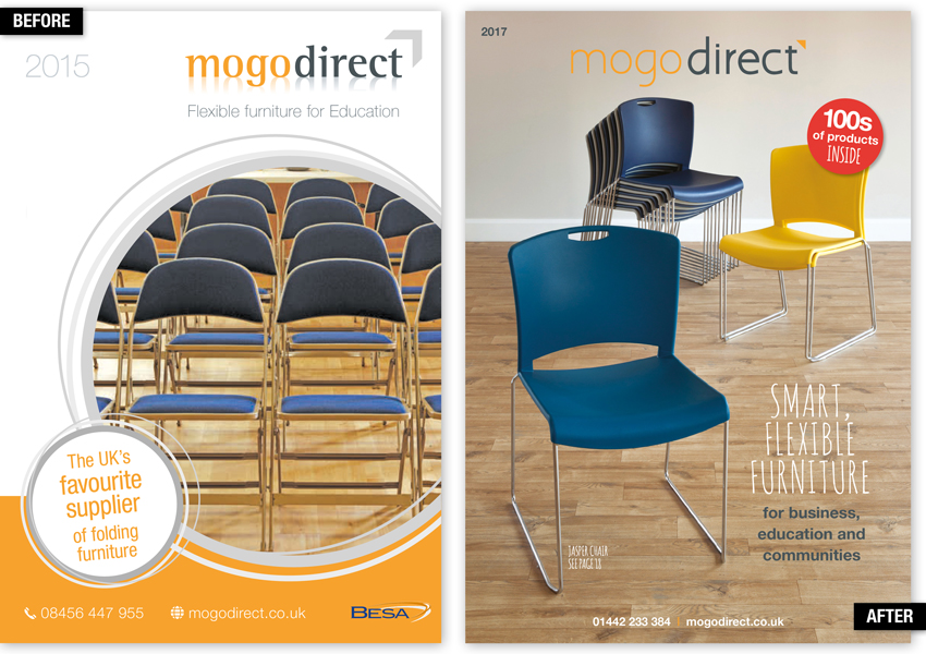
Before: The front cover is visually unbalanced, and the lifestyle shot is not very exciting.
After: We use a modern lifestyle shot of a key product - this combined with gorgeous uncoated paper gives the catalogue a contemporary feel (in look and touch). The bright red roundel entices people to open the cover. We include a large benefit-led headline with factual subhead and a call to action at the base. The logo is also updated to continue the new fresh modern approach, which was continued throughout the website and other corporate identity requirements like the stationery.
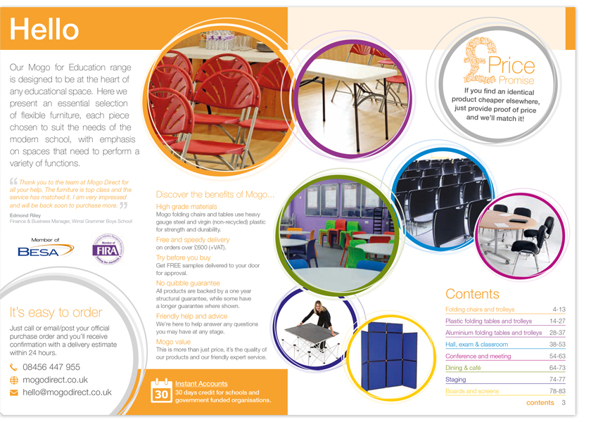
Before: There is a lot of information but it is not well-organised. The images on page 3 are not relating to anything within the catalogue so this space could be used to better effect.
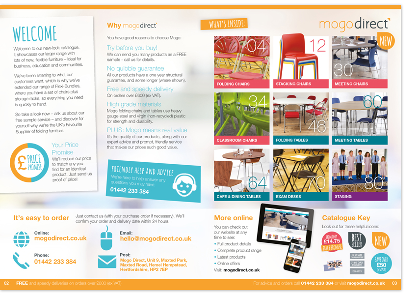
After: Visually lighter than existing catalogue, but with significantly more useful information. We include a panel of brand positioning copy that sets the scene. Page 3 is now a large visual array for navigation, showing contents, page numbers and product range. All the order details are brought out more strongly and organised at the bottom of the page. The logo is on the spread for brand presence and we include a key for directional graphic icons. Footers include a benefit line and call to action.
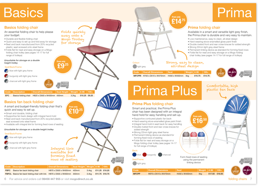
Before: The design uses up quite a bit of space at the top of the page, with the product names too big. The price roundels are rather large and distracting.
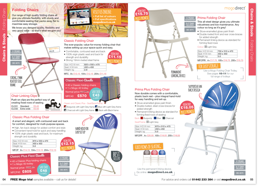
After: We give the spread a focus and encourage good eye coverage by introducing a couple of hero products. We also include consistent calls to action and service benefits. The logo is added to the top right on every page for brand presence. A small intro panel at the top with a small lifestyle image introduces sub-section with brand positioning copy.
We include a panel that pushes to website, for colours and more product information. The offers are brought out in coloured panels and key features of each products are in a friendly font to add personality. The tables are streamlined with the prices in the section colour to help them stand out. There is even space for the odd cross sell, directed choice graphics and pushes to the website for further product discovery.
Before: None featured.
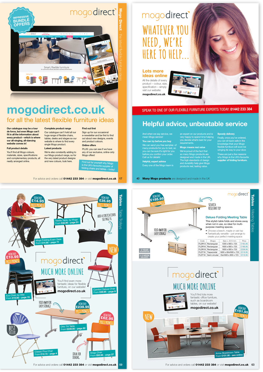
After: We introduce several stopper pages that are placed throughout the catalogue, to inject brand presence. They are friendly, professional, and bring across the major brand and service benefits or push to the benefits of using the website, in detail. These stopper pages also give a change of pace in the catalogue.
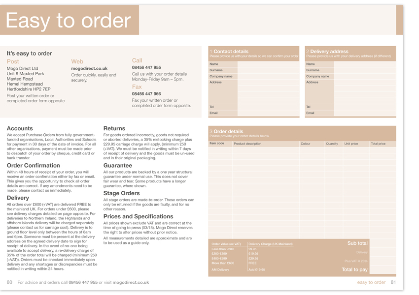
Before: This spread is rather dull and not visually engaging. It is far from the correct brand image and positioning and is effectively 2-colour print.
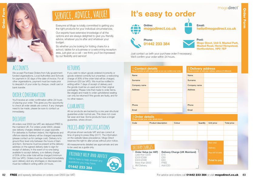
After: The order form is reduced to just 2 pages. We add a picture of a person to inject personality. The main text is ordered better using coloured headings. Brand colours help the important stuff stand out. A large ‘how to order’ panel reminds the customer of the necessary details. Clean, simple and easy to read - a perfect order form.
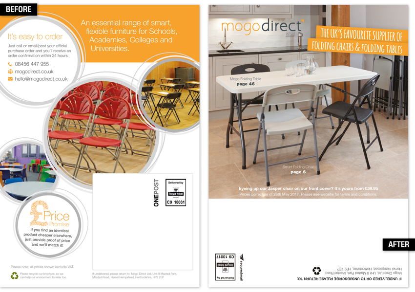
Before: Too busy.
After: The back cover is one of the best pages for selling, so a modern lifestyle shot is used with cross selling to the products inside. We include a large key positioning statement. The address panel is laid out better for ease of the printing and so it doesn’t interfere with the product sell.
Conclusion:
Our response to their brief demonstrates our understanding of Mogo’s brand and their objectives for their new catalogue. Our expertise in catalogue design and brand positioning means that we appreciate the modern catalogue has much more to do than just show products.
It must also act as your brand ambassador, communicating your points of difference and making a connection with the reader, whilst also stimulating sales – whether from the catalogue of from the website.
Incidentally, the client and their customers love the new catalogue!
We were very happy with our catalogue, but we decided to have a quick review. We’re so pleased we found TA Design – they turned a good catalogue into a really great one – and so much more! They fully understood our need to evolve and reposition the brand, and accomplished this for us with a sure and expert hand. They also helped us take a step back to evaluate what our catalogue was for, who it was for and what we wanted it to communicate – always bearing in mind that it is always a key sales and acquisition tool. Long story short, our new catalogue makes us look the business. It communicates our brand, shows our company persona and our USPs. It also shows off our products and gives our target audience the information they need to make an immediate purchase decision. From the big decisions to the little touches; from design, to tone of voice to paper spec., TA Design has used their creativity and marketing expertise to make a real, positive difference to our business.
Louise Stevens, Director, Mogo Direct